Crafto - DIY Website.
Project Overview.
Product
Crafto is a website with a wide variety of DIY tutorials and a DIY community. The average user is between 18 - 40, and most of them are college students or professionals. Crafto’s goal is not only to provide DIY tutorials but also encourage users to succeed in creating DIY projects.
My Role.
UX design
UX writer
Information Architecture
User Testing
Tools
Figma
Adobe Illustrator
Adobe Photoshop
Flowmapp
Problem Statement.
DIY tutorials are often scattered on different sites, with cluttered designs, complex navigations, and no search filters applicable.
The Goal.
Design of DIY website which is user-friendly. It will include clear categories and search filters as well as ways to encourage users to complete their DIY projects.
Understanding The User.
User Research Summary.
I conducted user interviews, which I then turned into empathy maps to better understand the target user and their needs. I discovered that users treat DIY as a creative and relaxing activity when they need a break from school or work. However, most of the DIY tutorial websites, are overwhelming, and confusing to navigate, which frustrates users. This caused a normally enjoyable experience to become challenging for them, defeating the purpose of relaxation.
User Pain Points.
1.
Resources.
Users always have to find DIY tutorials from many different sites which are time-consuming.
2.
Navigation.
The design of DIY tutorial sites is complex making navigation hard.
3.
Information.
DIY tutorial sites don’t provide enough relevant information for users.
Empathy Map.
Feels.
• It is upsetting when I cannot find a rating or comment section for each DIY project.
• It takes a long time to search for DIY tutorials online because there are so many poor results.
• DIY is therapeutic and takes my mind away from the monotony of daily routine.
Thinks.
• The DIY website should have user a rating and feedback
• There should be a reminder notification and setting of the goal within the user dashboard.
• The level of difficult is essential for any DIY project.
Does.
• Spending too much time looking for the appropriate DIY project.
• I enjoy doing DIY activities when I need a break from my daily routine.
• When I am inspired to do something craftily, I set on new DIY projects.
Feels.
• Enthusiastic to connect with others who share a common interest.
• Frustrated when I find Incomplete & misleading DIY projects on the internet
• Worried when I miss my project deadlines without any reminder.
Persona.
Problem Statement: Angie.
Angie is a creative student who is passionate about DIY and needs a way to find proper DIY activities and share the experience because she loves to spark the ideas and communicate with other DIY enthusiast
Angie.

Age:
Education:
Hometown:
Family:
Occupation:
22
Media
Nakuru
Single
Student
“I always craft my happiness”
Goals.
• Able to see the level of difficulty of DIY projects.
• Less worried when there are ratings & a comment section.
• Have a community of DIY enthusiasts on a website.
Frustrations
• Concerned about her ability a DIY project due to its difficulty.
• Spend too much time searching for DIY tutorials placed 0n multiple sites.
• DIY with incomplete information
Angie is a 22 year old Mass Media student. She lives with her auntie who is near Nakuru town. She found out that she is passionate about DIY and she spends a lot of time searching for new ideas.
She is always hesitant to begin new projects because the DIY resources she gets are sometimes misleading or contain incomplete information. She would also love to see feedback and ratings from others who have completed the same projects. Furthermore, she would like to communicate and share ideas with others in a proposed community tab.
User journey map.
Persona: Angie.
Easily browse for DIY tutorials and get motivated.
Starting the design
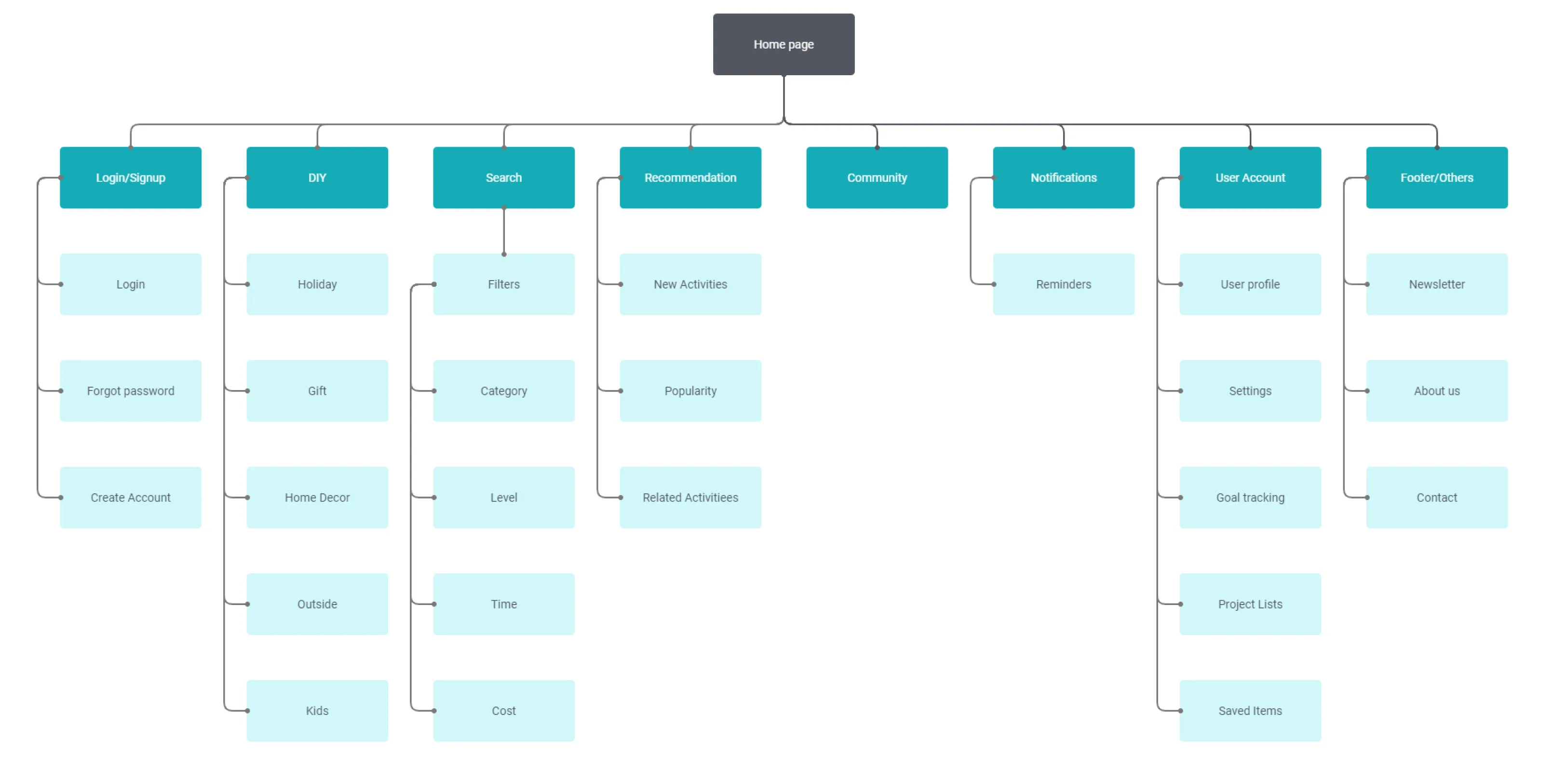
Sitemap.
Difficulty with website navigation was a primary pain point for users, so I used that knowledge to create a sitemap. The goal here was to make strategic information architecture that would improve overall website navigation. The structure chosen was designed to make things simple and easy.
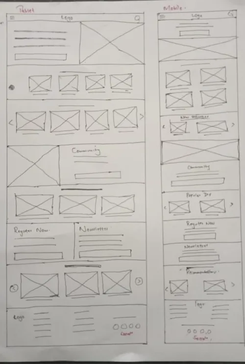
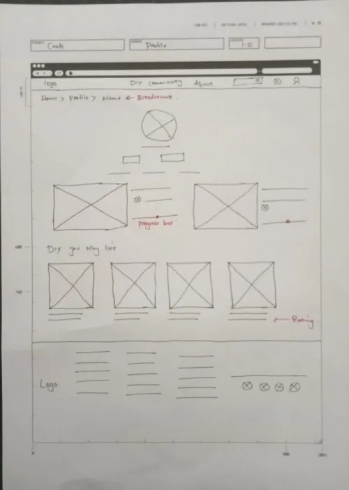
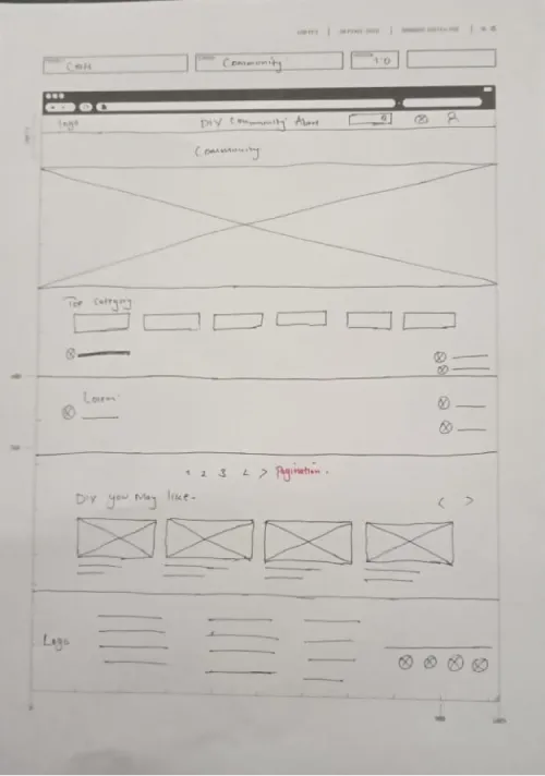
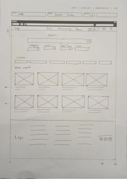
Paper Wireframes.
I sketched each screen of the website, keeping the user's pain points about navigation, browsing, & filtering in mind. The home screen sketches variations focus on optimizing the browsing experience for users on desktop and cascade down to tablet and mobile screens.
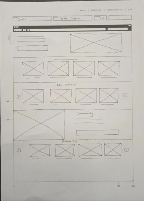
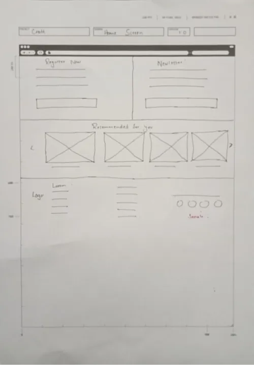
Digital Wireframes.
Moving from paper to digital wireframes made it easy to understand how the redesign could help address user pain points and improve the user experience. Prioritizing useful button locations and visual element placement on the home page was a key part of my strategy.
Low-fidelity prototype.
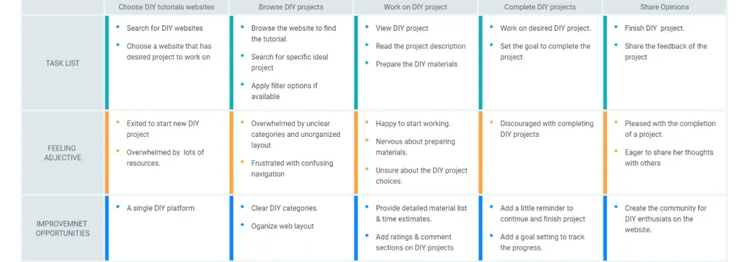
I conducted the usability study with the interactive lo-fi prototype. Findings from this study helped in identifying ways to improve the user experience on the DIY website. These were the main findings uncovered by the usability study:
Usability study.

Study Type:
Unmoderated
Usability Study

Location:
Town Area
Lovington

Participants:
4 participants

Length:
10-15 Min
I conducted the usability study with the interactive lo-fi prototype. Findings from this study helped in identifying ways to improve the user experience on the DIY website. These were the main findings uncovered by the usability study:
1.
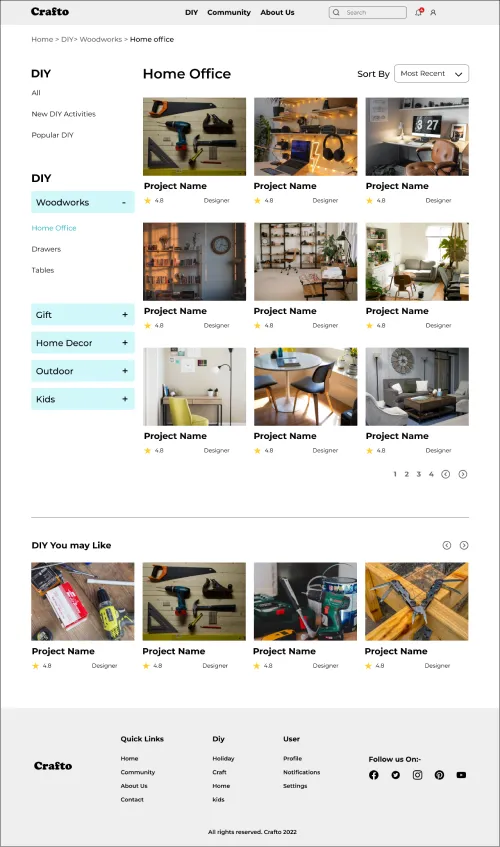
Search page.
Users want an easier way to navigate to the search page.
2.
DIY project page.
Users want additional guidance to navigate inside the DIY projects page.
3.
Instructions.
Users want a more intuitive way to follow the DIY instructions.
Refining the design.
Mockups.
Based on the insights from the usability study, I made several changes to improve DIY search flows. As many users prefer to look for DIY projects by searching keywords. Some of the changes I made were:
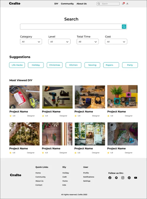
1. Replacing the search Icon with a search bar that automatically brings the search page as an overlay. This was more intuitive thus allowing the users to reach to search page with ease.
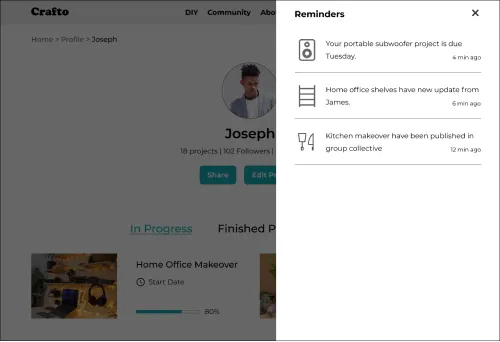
2. To make it users easier to set on a new DIY project, I added extra guidance on the project page that requires users to scroll down to follow the DIY instructions.
3. I also refined the options on the search page by including keyword suggestions and the most viewed DIY for users so as to provide a better flow experience.
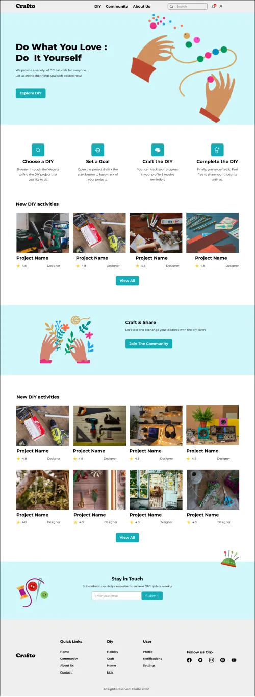
High-fidelity prototype.
To create a hi-fi prototype, I connected all screens designed with active buttons, responses, micro-interactions, and animations to emulate a real website to be implemented by coding.
Accessibility considerations.

I used a major third type scale which attained perfect visual hierarchy

I used landmarks to help users navigate the site, including users who rely on assistive technologies.

I used Icons and images to assist users with clear task flows.
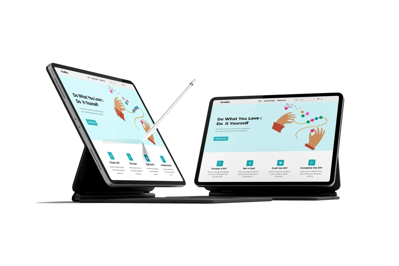
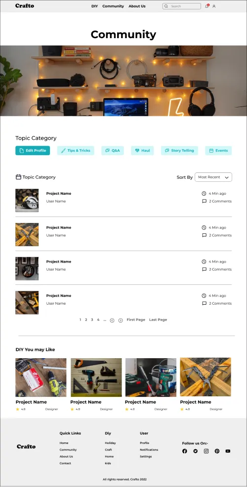
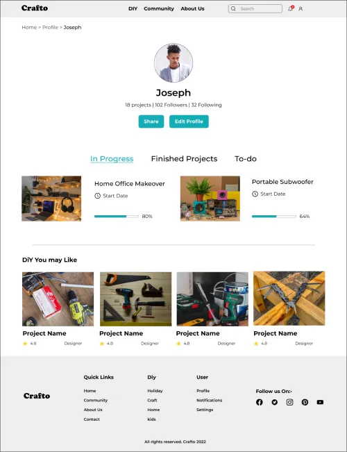
Walkthrough Screens.
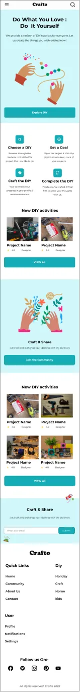
Home screen.
Asset Library.
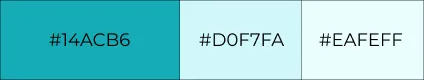
Color Pallet.
Primary Colors
Typography.
Typography(Montserrat)
Type Scale:
Major 3rdBase font: 18px
Heading 1
Heading 5
Paragraph
Caption
Spacing.
Sections 96px
72 px
64 px
32 px
16 px
12 px
Secondary Colors

Going Forward.
Takeaways.
Impact.
Our target users shared that the design was intuitive and easy to navigate through, more engaging with a demonstrated clear visual hierarchy.
Users discovered that the website has a minimal style but still very informative. They also found search filters helpful.
What I learned.
I have learned that design isn’t just about beauty but it needs to be informative and user-centric. The processes for understanding the user are very important as well as the feedback is given. It provides significant improvements to the websites for a better user experience.
Going Forward.

Conduct another round of usability testing for the prototype.

Ideate on the feedbacks given to add more features to the website

Enhance accessibility for all types of users.
Share you business ideas via:
Email: Info@njengathegeek.dev
or Book a 15-30 min Call
Book a Call